Case Study
Designing trust: rethinking a sustainability report
Making a sustainability report with a story visitors could actually understand and trust.
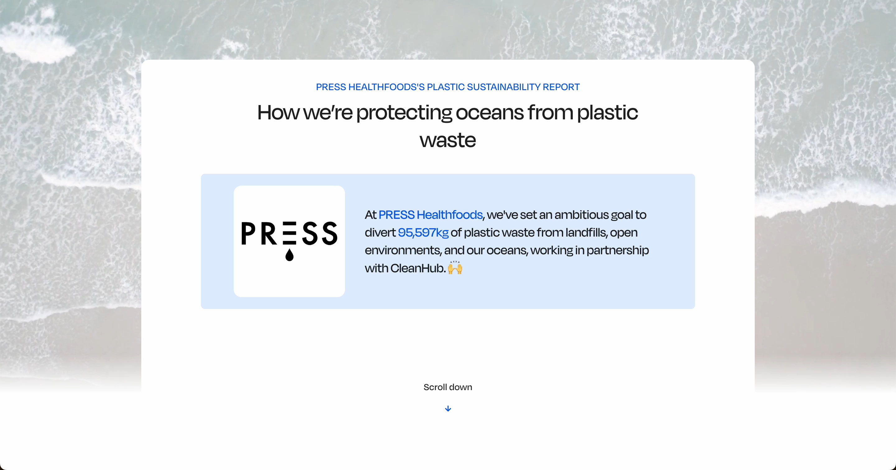
Overview
CleanHub helps brands recover ocean-bound plastic by partnering with collection hubs in coastal communities across Asia. Each participating brand received an Impact Report: a public page designed to demonstrate the impact generated through their partnership with CleanHub.
While the reports were designed to communicate transparency and accountability, they struggled to translate a complex plastic recovery process into an experience that felt clear, trustworthy, and engaging for everyday visitors.
As the sole designer, I led the project end-to-end, from research and problem framing to UX strategy, content structure, and UI design. Working closely with Product, Engineering, Customer Success, and Marketing, I defined the redesign approach, validated concepts through user research, and guided the experience through two iterations.
The Problem
Process-heavy and hard to trust
The original Impact Report was built around CleanHub's collection process rather than the needs of the people reading it. Behavioural analytics and customer feedback suggested that visitors were struggling to engage with the experience: important content was often missed, average time on page was low for a report of this depth, and brands were hesitant to actively share it with their customers.
To understand why, I combined moderated user testing and competitive analysis with Customer Success interviews and behavioural analytics.
<1 min
duration in 75% of sessions, despite the report's length and complexity
Only ~25%
of visitors reached the end of the core impact section
Only ~45%
of interviewed brand partners felt confident about using the report to communicate their impact
Note: figures rounded and absolute values omitted to protect confidential data.
Research revealed that visitors came to the report looking for answers to three simple questions:
- Why is this brand taking action?
- Can I trust these claims?
- What impact is actually being made?
Instead, the experience was optimised around explaining CleanHub's internal process. This created three key problems:
The brand's story wasn't leading
The report was written from CleanHub's perspective, making the brand feel secondary.
Trust signals lacked context
Impact data was visible, but visitors couldn't tell where it came from or why to trust it.
Key information was hard to find
Long content and a process-driven structure buried key information throughout the page.
Generic hero with little brand context
Progress metrics lack context
Map provides limited context
Dense content blocks
CleanHub's process dominates the narrative
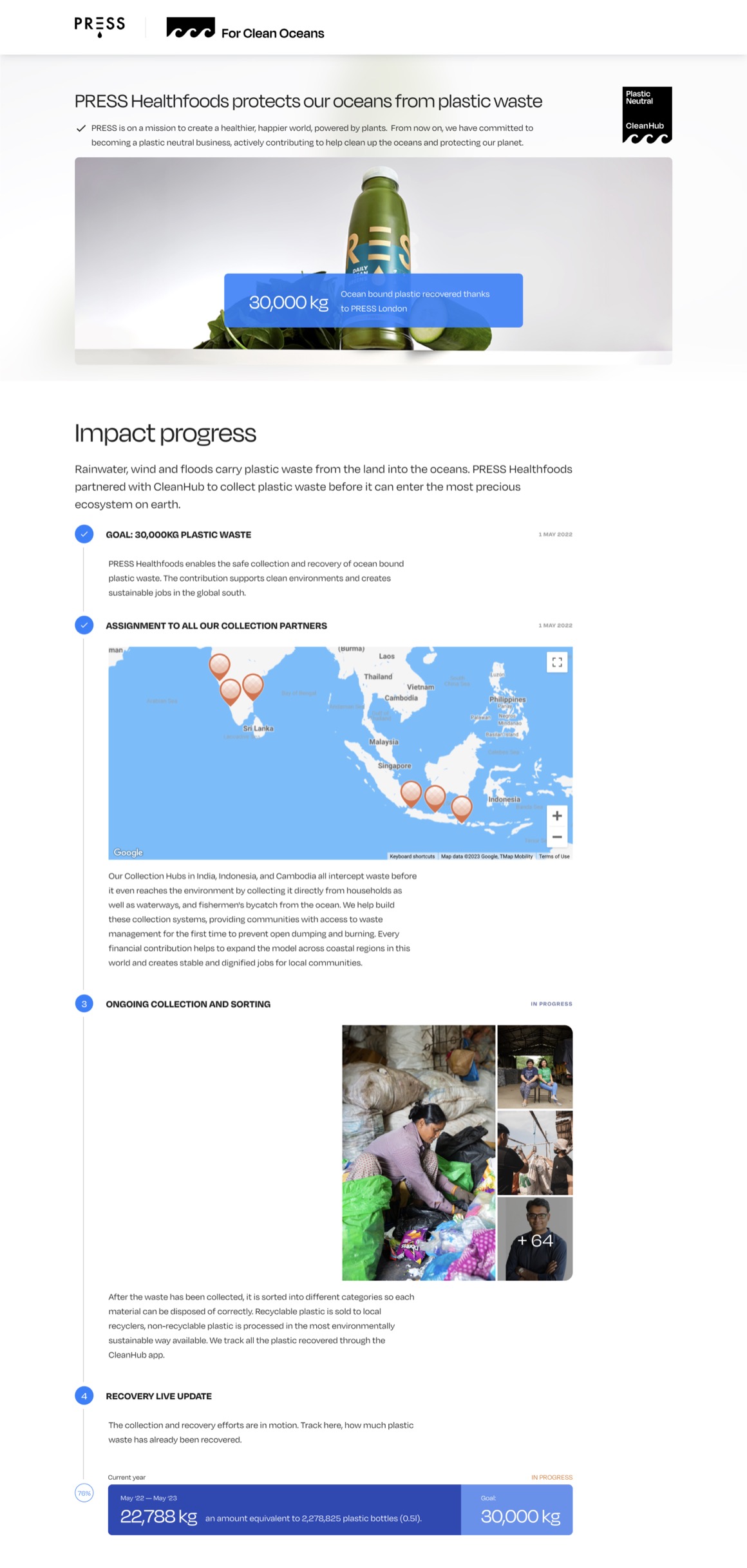
No clear explanation of why the brand is taking action
Questions about the veracity of the photos and "real time" claim
A drop off of visitors at this point
Excessive scroll length
Collection numbers are difficult to interpret and not verifiable
Design Challenge
Make the report more engaging and easier to understand without compromising its credibility.
The Process
An iterative approach
Rather than redesigning the entire report at once, we approached the project as two focused iterations.
As a small team balancing multiple product initiatives, a phased approach allowed us to improve the highest-impact areas first, validate assumptions with real users, and use those learnings to inform a broader redesign.
V1: improving transparency
The top section was restructured to give visitors enough context to keep reading. Redesigned the impact progress bar that included multi-year data and placed it front and center, as well as added a condensed version of it persistently to the navigation bar. An explanation of why plastic collection matters gave new visitors the context they needed without requiring them to scroll for it.

Other changes included adding a reduced live impact dashboard from the total impact across CleanHub and simplifying the Community Updates section.
After
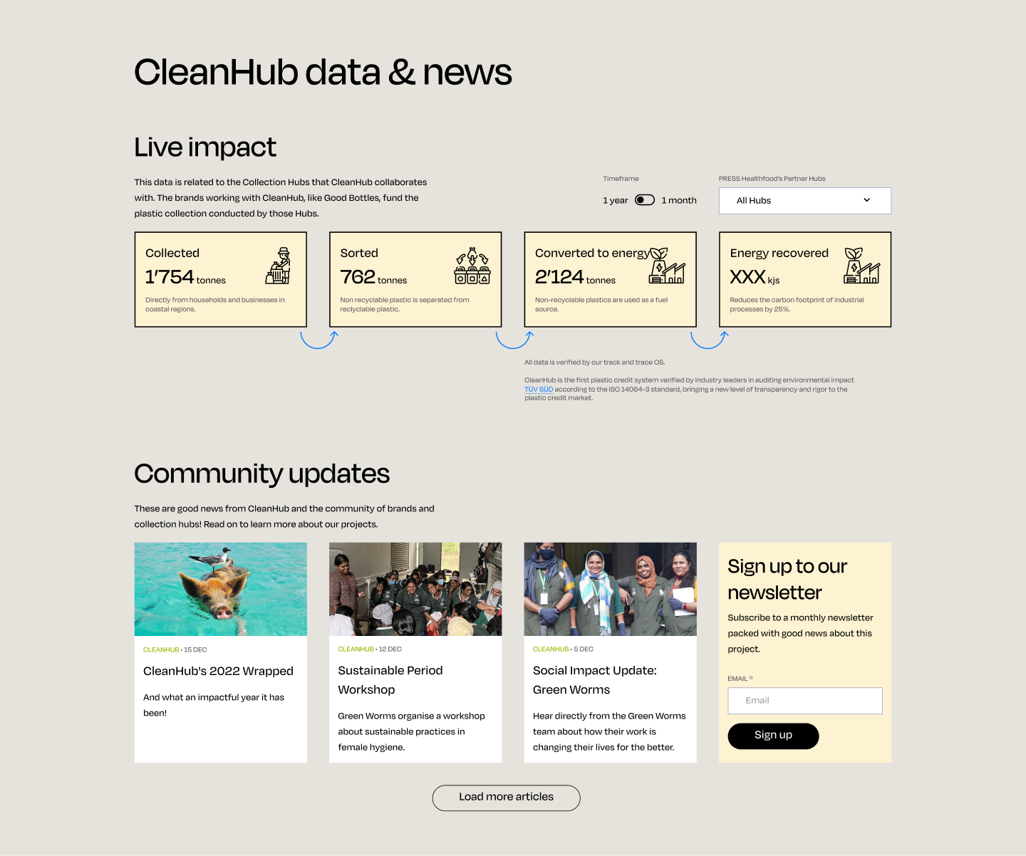
Data you can read, understand, and trust
Turns a claim into an auditable fact
Compact grid replaces long-form layout
Further structural changes to the timeline format and remaining narrative were intentionally deferred until we could validate whether this approach and additional data improved trust and engagement.
V2: balancing storytelling and transparency
After releasing V1 we ran follow-up interviews and monitored performance, which brought us to a new guiding principle.
What worked
- Scroll depth increased (but so did the page length)
- Time spent in page increased but not significantly
- Interviews showed improved comprehension of the impact model
What we learned
- 1All the added data elements increased visibility but also complexity
- 2The report became visually heavy and focused on reporting over storytelling
- 3The Live Impact section distracted from the brand's story
- 4Visitors still struggled to connect to why the brand was acting
new guiding principle
Transparency alone doesn't build trust. Storytelling does.
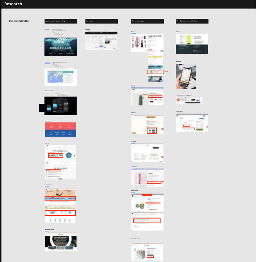
To shape V2, I ran a competitive analysis to see how other platforms handled trust and transparency, combined with what V1 had already taught us. I explored a new concept and ran another round of usability testing, this time shifting focus from adding more proof to finding a better balance between transparency, storytelling, and usability. Rather than targeting specific sections, V2 became a complete overhaul, one I aligned on with leadership, PTech, and Customer Success before moving forward.
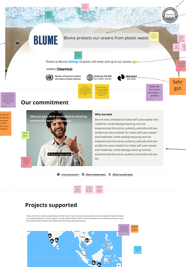
Usability testing analysis
Competitive analysis
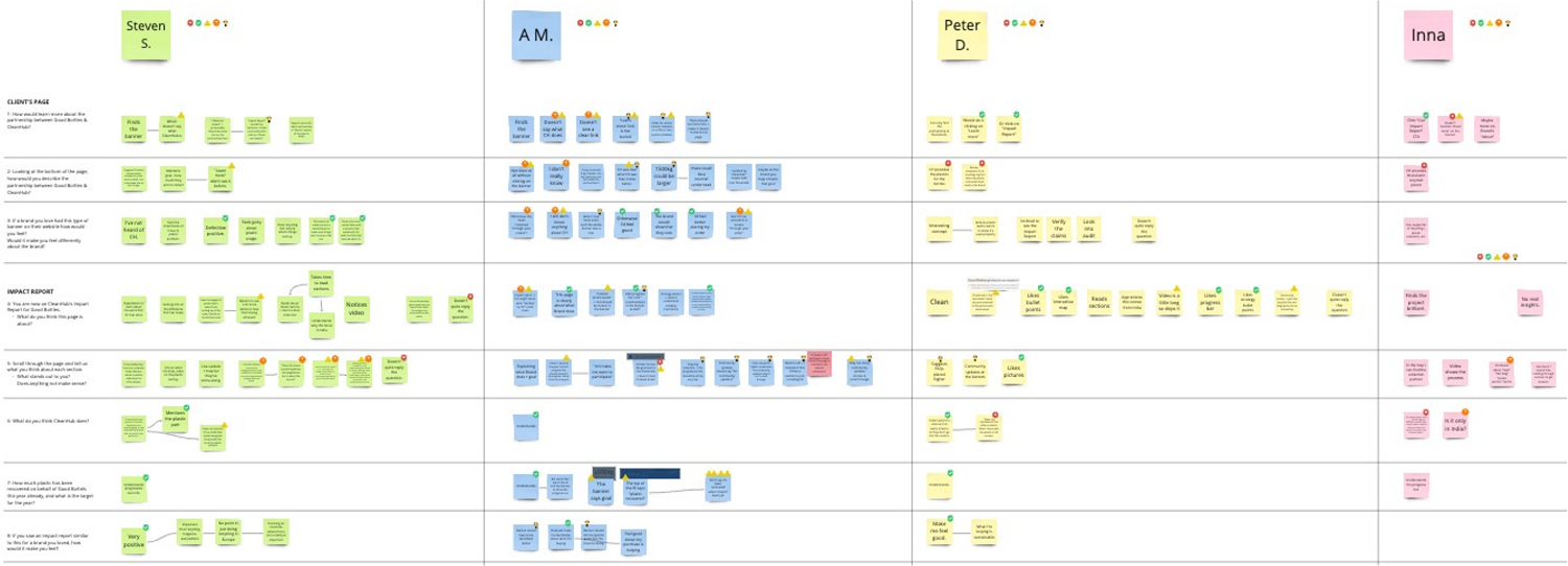
Interview insights analysis
Let's break down the new choices
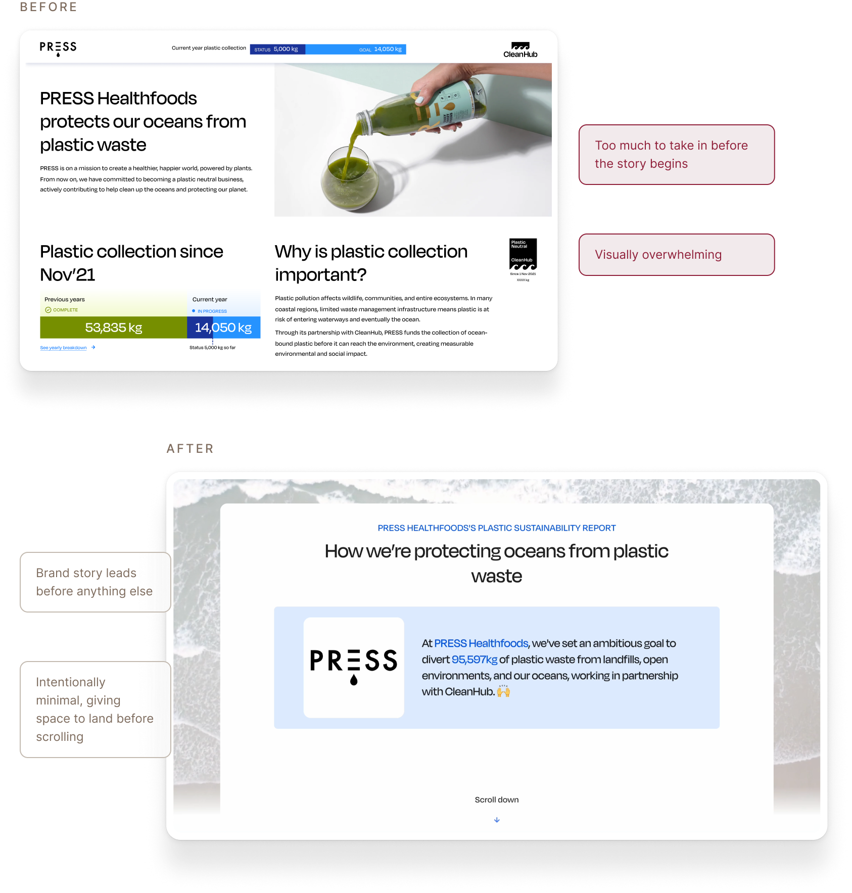
Leading with less
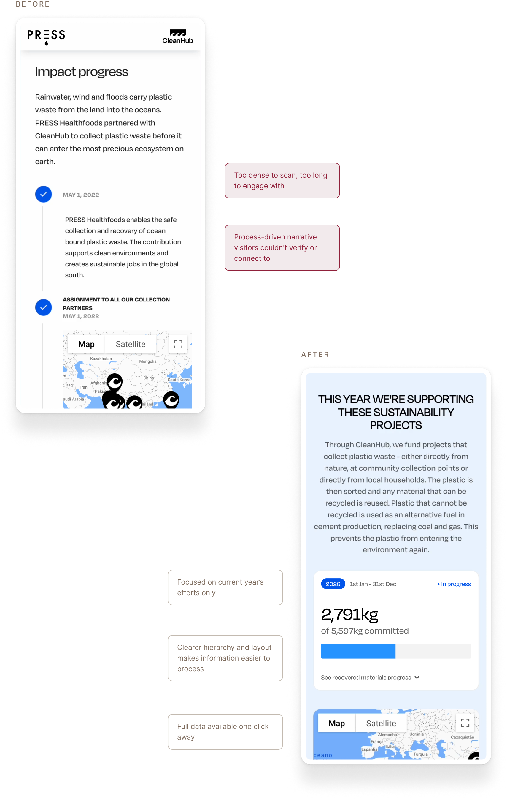
The hero was redesigned to focus solely on the brand's mission and sustainability commitment.
Complex impact, simply told
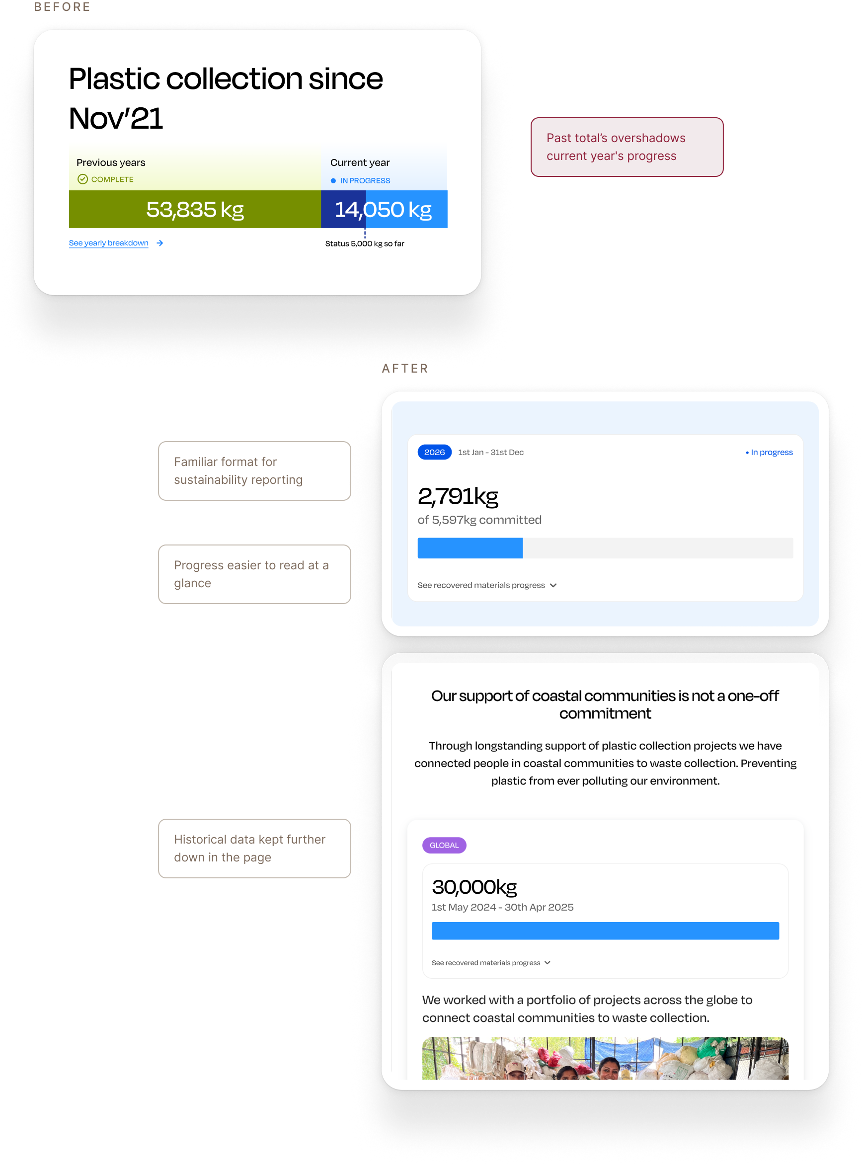
The collection timeline explained impact through CleanHub's process, too detailed and technical for a first-time visitor. We replaced it with a cleaner, more digestible view of the impact the brand funded that year.
Year on year breakdown
Separated the narrative of long term impact and made the report focus on current efforts.
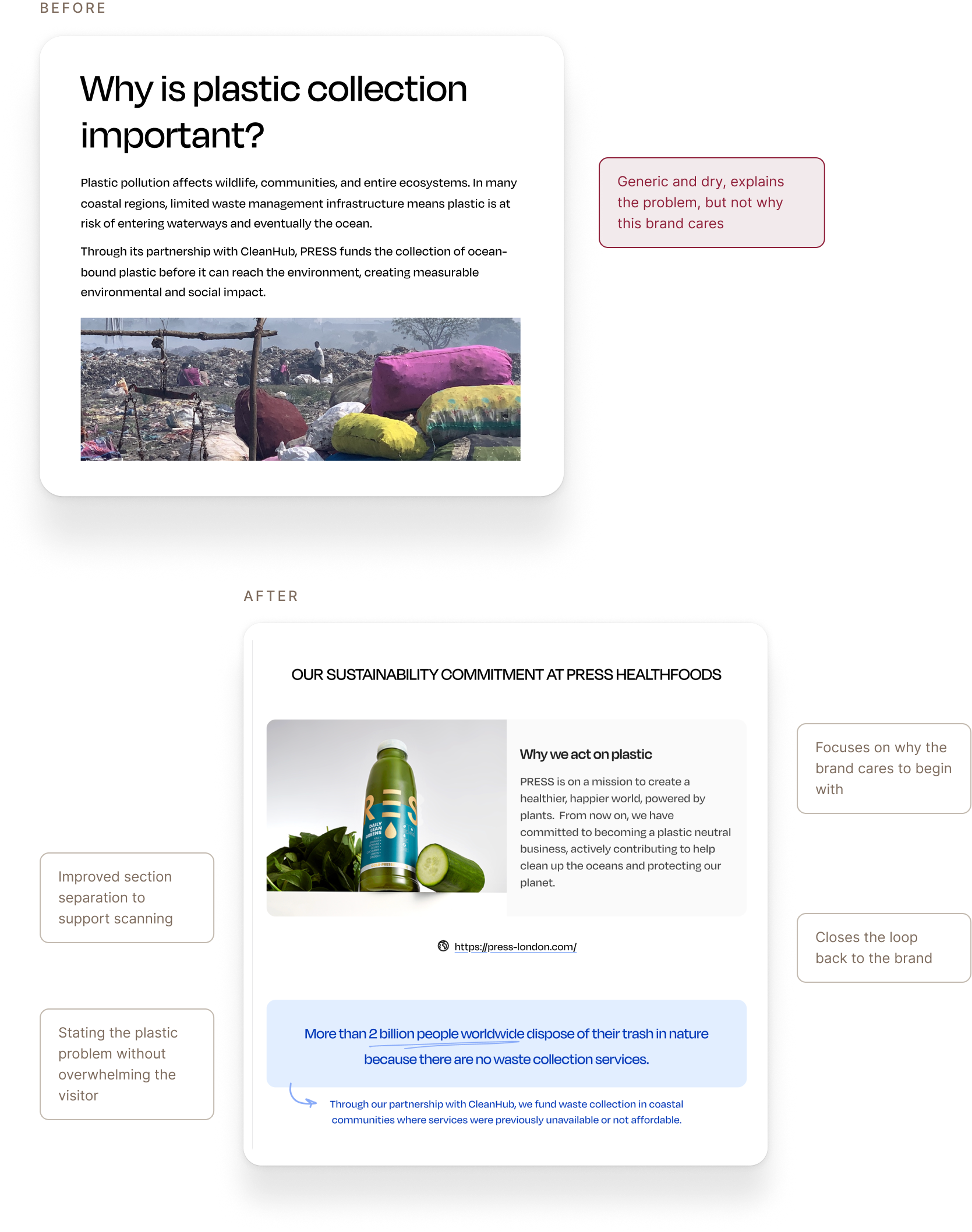
Why it matters, in the brand's voice
The generic explanation of plastic collection was replaced with the brand's own story, why they act, and why it matters, told concisely.
Outcome
Between proof and story
3.5x
increase in time spent on the page
~50%
of visitors reached the end of the core impact section
80%
of brand partners felt more confident using it to communicate their impact
75%
of visitors rated the report as trustworthy or highly trustworthy
Note: figures rounded and absolute values omitted to protect confidential data.
The redesign transformed the Impact Report from a reporting tool into a customer-facing sustainability asset. Visitors engaged more deeply with the page and found it easier to understand and trust, while brand partners felt more confident using it to communicate their sustainability commitments.
What made this project successful wasn't a single redesign, but the opportunity to learn through iteration. We started by making impact data easier to access and understand, only to learn that information alone doesn't create trust. Visitors needed a clearer narrative — one that explained why the brand was acting, not just what had been collected. The most successful version of the report wasn't the one with the most data. It was the one that balanced proof with story.