Case Study
Restructuring a customer dashboard for what matters most
Turning a dashboard that buried its own value into an at-a-glance path from progress to action.
Overview
CleanHub connects brands with plastic collection projects in coastal communities, giving them an Impact Platform to track and communicate the difference they're funding. The value loop for brands is simple:
fund recovery → understand your impact → communicate it
The dashboard is the only surface customers touch at every stage of that loop, and the first thing they see on login.
As new features were added, including content and onboarding, the dashboard grew as a stack of cards, following the layout it started with. That pattern didn't scale. Customers could still find things, but couldn't tell what mattered or where to go next.
The Problem
The dashboard wasn't behaving like a dashboard
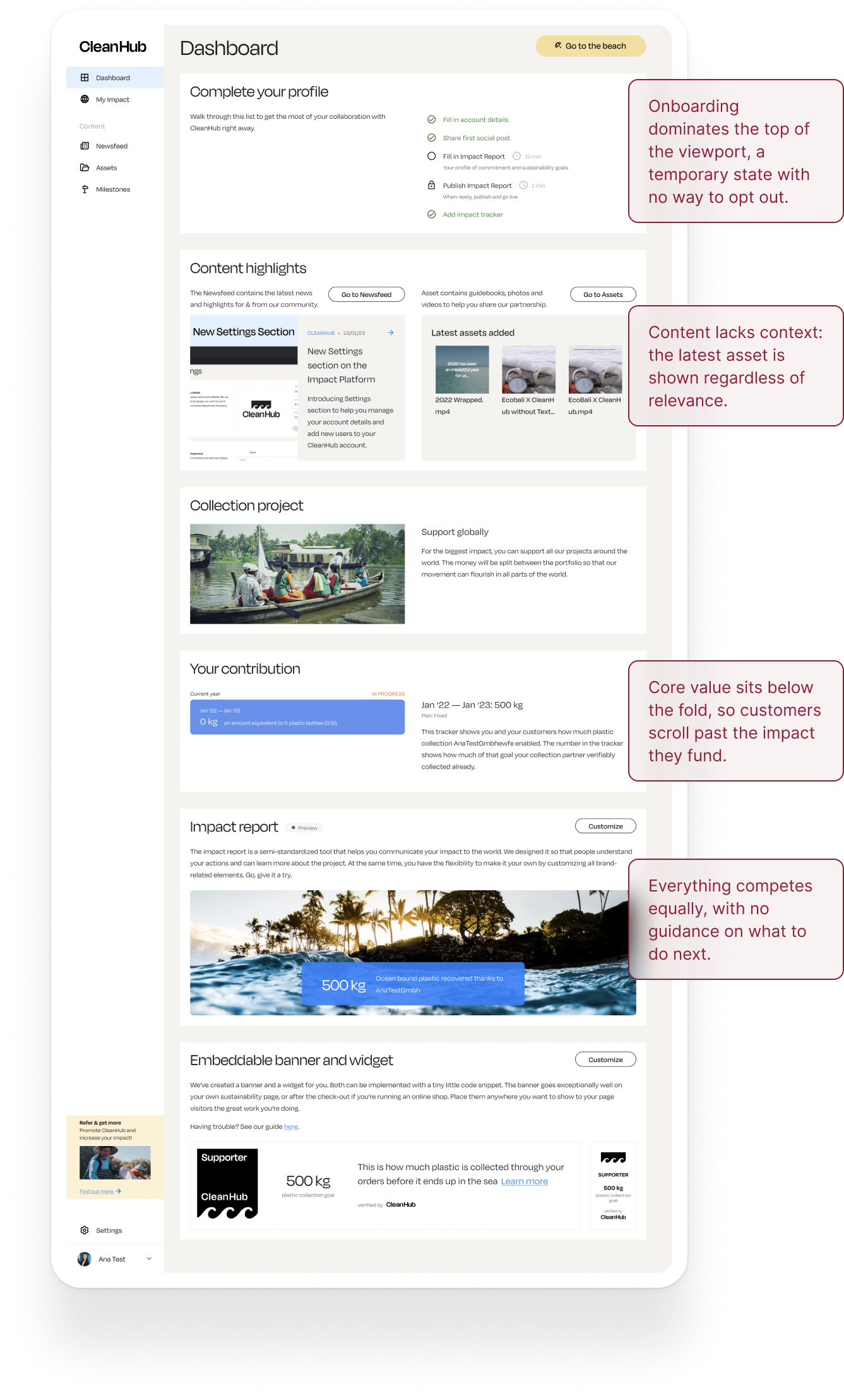
A dashboard should provide orientation at a glance: what's happening, what matters, what can I do next. This one struggled with all three: everything stacked with similar prominence, showing everything and prioritising nothing.

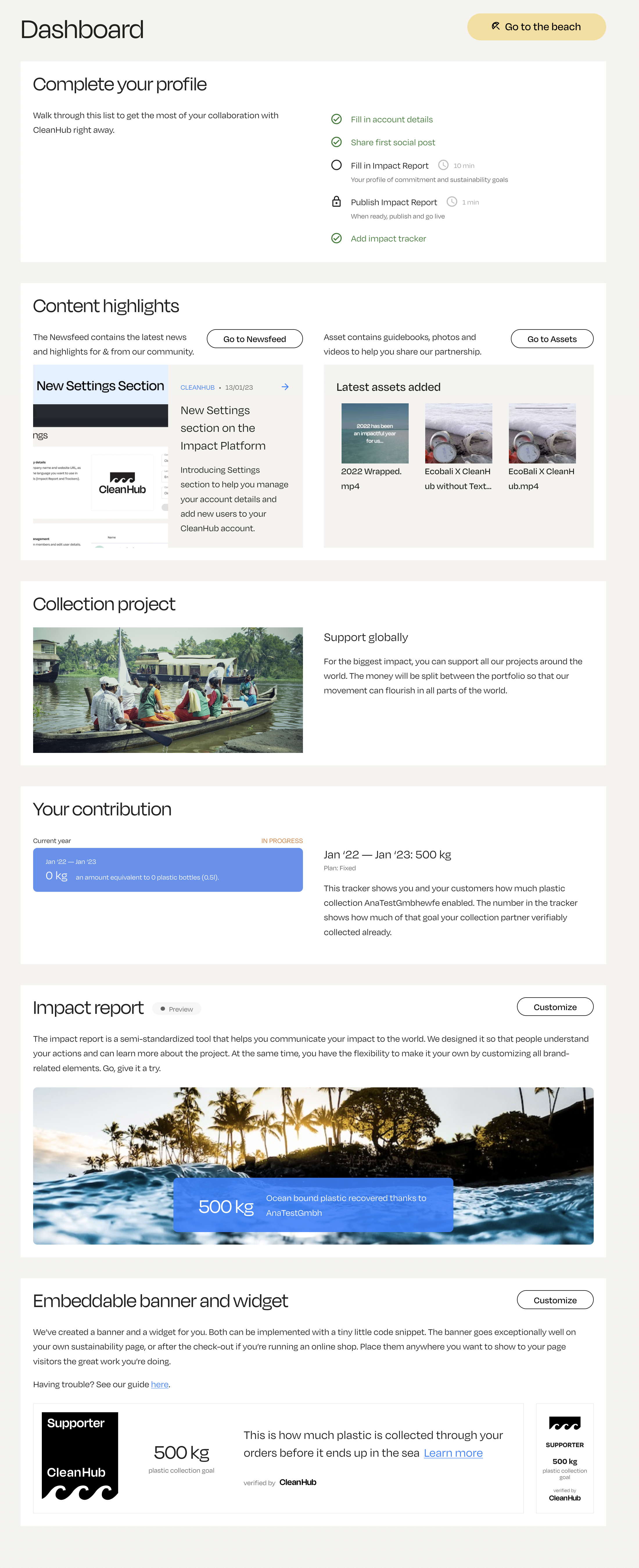
Onboarding dominates the top of the viewport, a temporary state with no way to opt out.
Content lacks context: the latest asset is shown regardless of relevance.
Core value sits below the fold, so customers scroll past the impact they fund.
Everything competes equally, with no guidance on what to do next.
The data backed our concerns:
~15%
of sessions that led to content discovery originated from dashboard entry points
~45%
of dashboard sessions ended without a meaningful next action
Under 20%
of customers downloaded a communication pack
Note: figures rounded and absolute values omitted to protect confidential data.
Uncovering recurring needs
I used AI-assisted synthesis to cluster customer interview notes and recurring Customer Success feedback, then compared those patterns against behavioural data.
This helped separate one-off requests from recurring needs, and three patterns consistently emerged:
Check progress
Customers returned primarily to check their recovery progress.
I usually just want to see where we are.
Communicate around key moments
Customers were more likely to communicate around a milestone or awareness day.
It's easier when there's actually something new to say.
Complete a known task
Customers accessing the web trackers knew what they needed.
If I need the report, I just want to get to it.
The state of the dashboard did not reflect that: no quick way to check progress, random assets and news were being pushed instead, no fast path to the report or widget.
How might we help customers understand their current impact and identify the most relevant next action while keeping everything within the viewport?
Design Challenge
Turn the dashboard into an at-a-glance action surface
The Process
Deciding what earns the viewport
I set a few principles to guide the layout:
- Everything a customer needs should fit within the initial viewport.
- Three company priorities had to be honoured:
- Company strategy was geared towards pushing content discovery and communication pack downloads, CleanHub's core value.
- Leadership wanted to keep "Collect more" as a referral CTA.
- Customer Success wanted onboarding mandatory with no opt-out until complete.
- Only what's actionable or relevant on most visits earns a place.
Applying these principles to the existing sections established a starting hierarchy, and revealed what didn't belong on the dashboard.
Interviews showed customers rarely needed the informational “Collection project” section, so it didn't justify permanent dashboard space. The upcoming Impact page gave it a more natural home, alongside the progress data it explains.
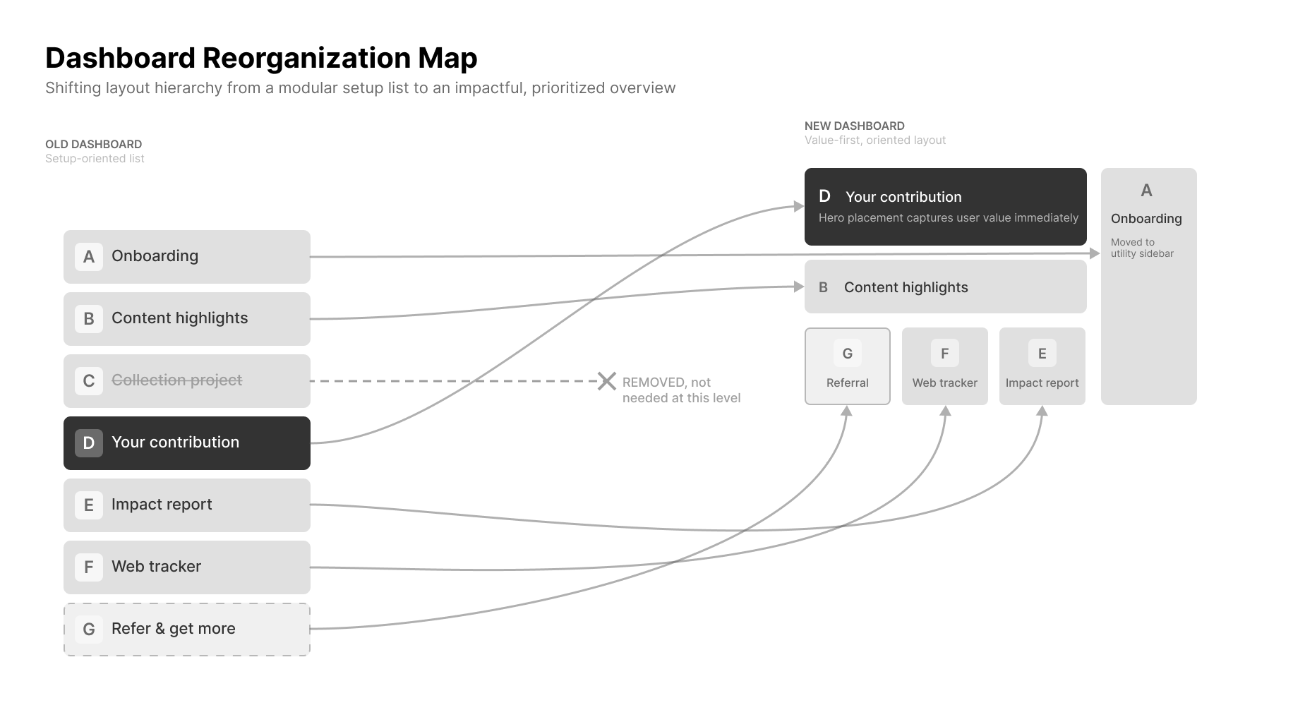
The first pass established a structure, but not which need should lead, or how that priority would hold up against company goals.
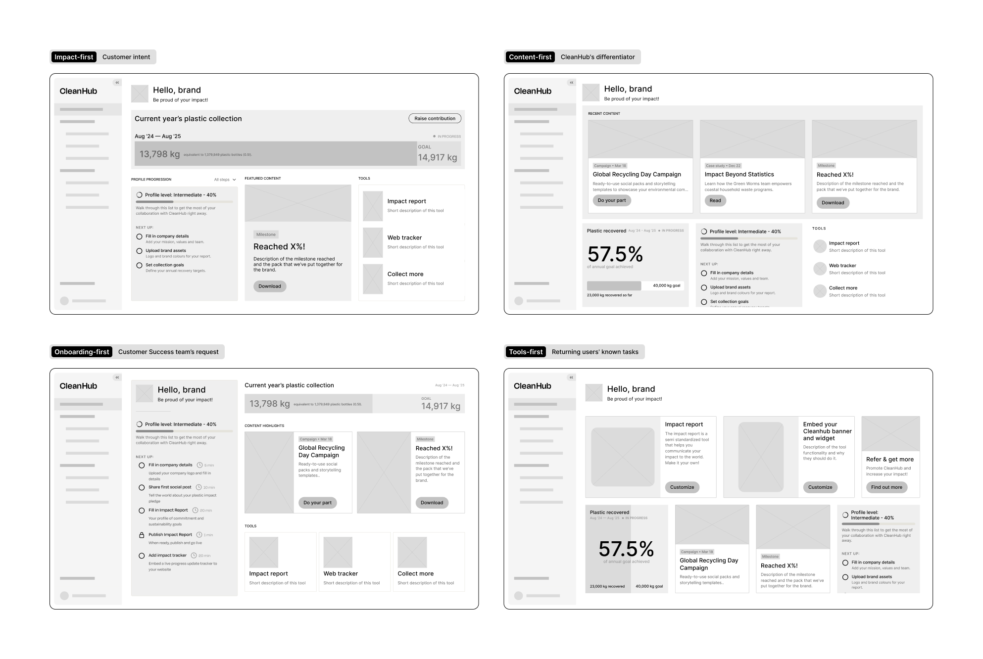
I used AI to explore alternative structures, each built around a different priority: impact, content, onboarding or tools. Seeing them side by side made the trade-offs concrete.
The options clarified the trade-offs, but I still needed a way to prioritise them.
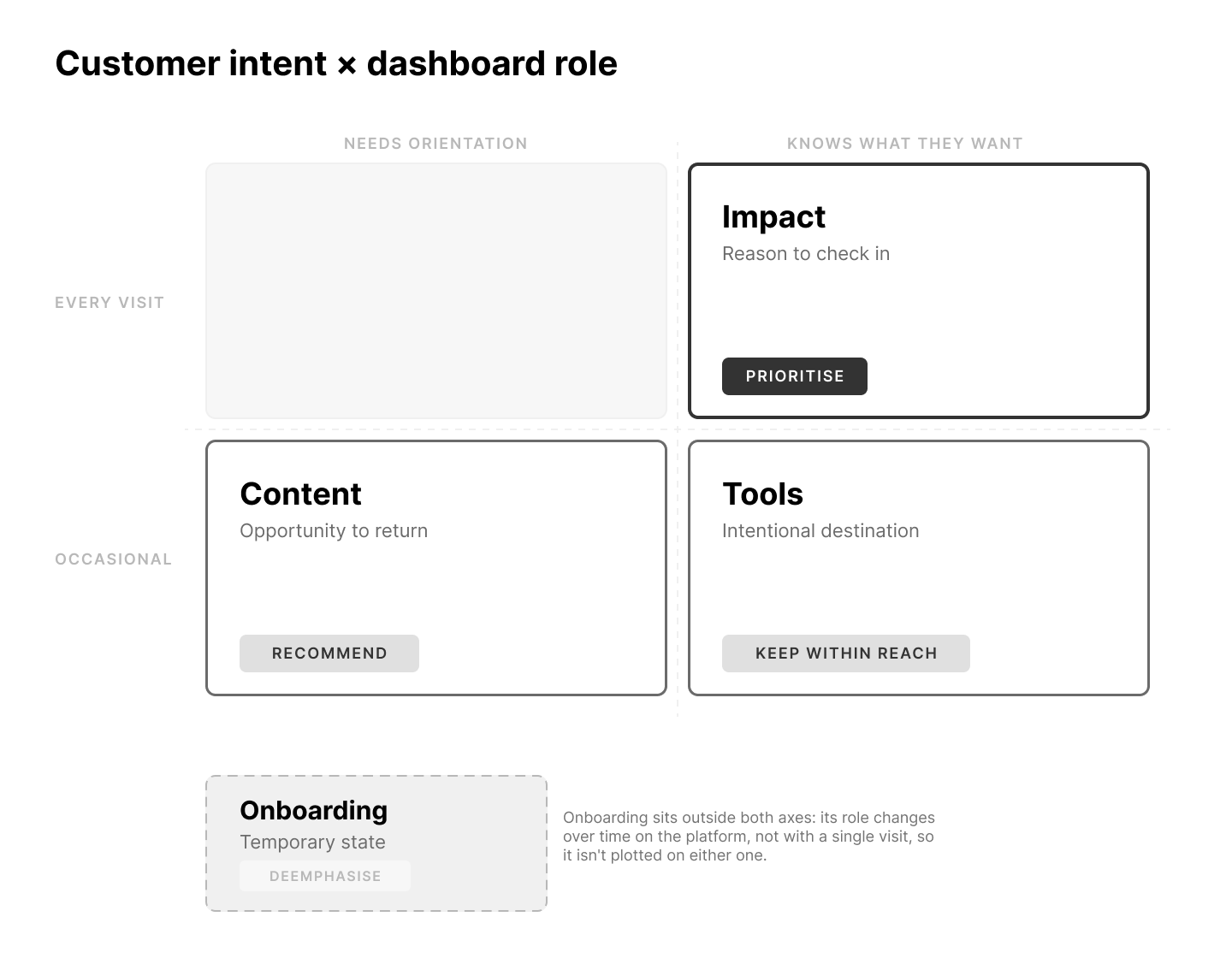
So I pushed the discussion toward strategy, mapping each dashboard element against customer intent and its role for the company:
- Impact, prioritised. Checking progress was the main reason customers returned.
- Content, recommended. It was CleanHub's core value and the product's strategic focus, yet only ~15% of content discovery started from the dashboard.
- Tools, within reach. The impact report and web tracker weren't regular reasons to visit. Customers arrived knowing they needed them, so they needed a reliable place, not prominence.
- Onboarding, de-emphasised. It competed for prime space despite being temporary. Once complete, it disappeared, so it didn't warrant permanent prominence.
Three decisions came out of that:

Fitting one viewport meant moving things out
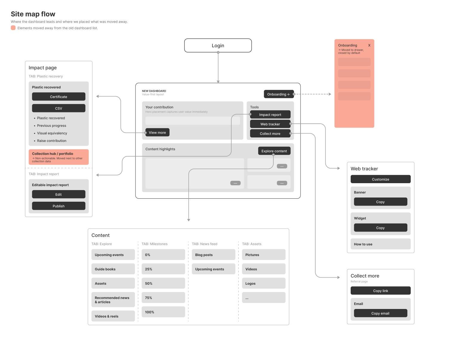
Everything that left the dashboard needed a clear home. I mapped each entry point from the dashboard to its destination so nothing ended up orphaned:
- View more: opens the Impact page, now also home to the collection project.
- Impact report: opens Report editing within the Impact page.
- Web tracker: opens its dedicated page.
- Collect more: opens its dedicated page.
- Explore content: opens the Explore tab within Content.
- Onboarding: moves into a collapsible drawer within the Dashboard.
Together, these decisions created a dashboard that orients, prioritises and points to action, all within the initial viewport.
After
State: new customer, no recovery yet
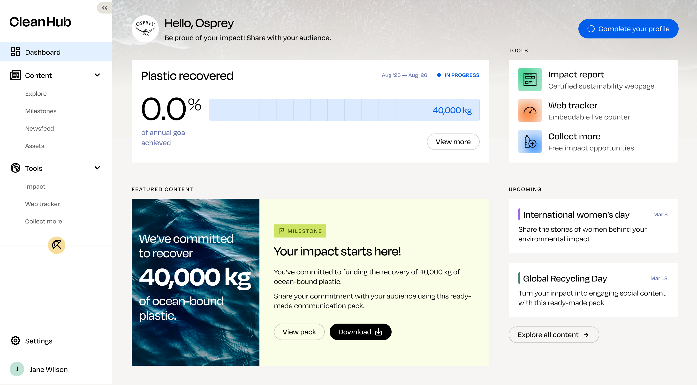
State: onboarding open
Optimising the journey from discovery to download
The final experience connected two paths to content: discovering something relevant on the dashboard, or intentionally browsing the wider library. Both led into the same preview and download flow.
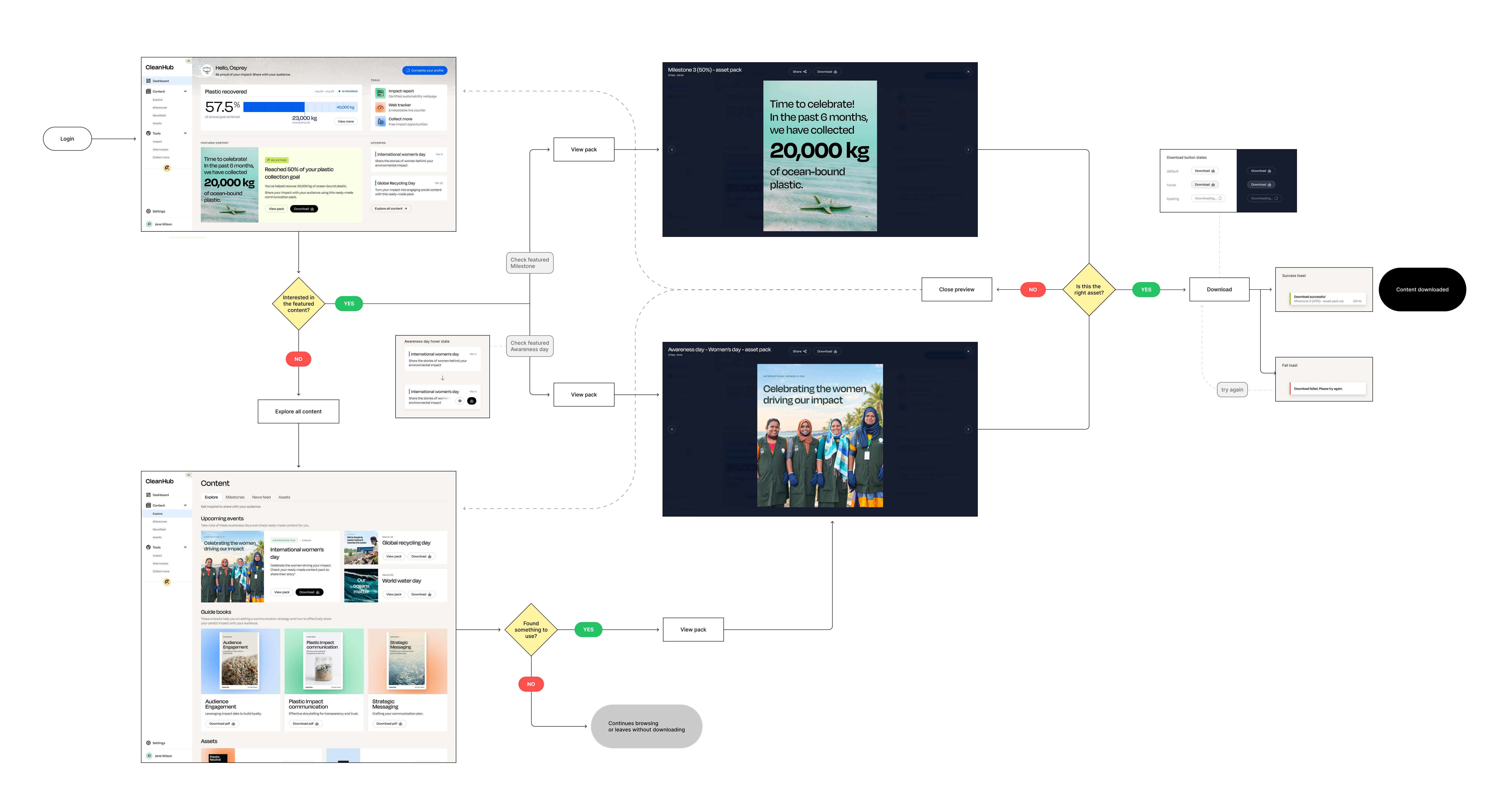
Before shipping, I validated the design with CS, PM, and original interviewees through a task-based walkthrough. CS questioned whether lower prominence would hurt completion, but we agreed access mattered more than attention for returning customers. Engineering then phased the rollout, keeping the hierarchy intact as scope evolved.
Outcome
From feature catalogue to action surface
The redesign wasn't only about exposing more functionality, but about helping customers understand where they were and what to do next. Especially to bring them in the value loop and compel them to communicate about their sustainability efforts.
After launch, customers engaged more with the parts of the dashboard that reflected their goals, while fewer sessions ended without meaningful follow-up.
~40%
of sessions that led to content discovery originated from dashboard entry points
~65%
of dashboard sessions continued to a meaningful next action
-30%
time to first meaningful action
+60%
communication pack downloads
Figures from the first 3 months after launch; rounded, absolute values omitted.
Rather than relying on customers to know where valuable content lived, the dashboard began surfacing the most relevant opportunities at the right moment, whether that meant celebrating a milestone, downloading communication assets, or accessing the tools they already depended on.
The most important outcome wasn't higher click-through rates; it was a clearer behavioural pattern. Customers were moving from checking progress to taking a next step, which was the core purpose of the dashboard from the beginning.
The work highlighted how product surfaces accumulate business goals over time, and unless someone continually refocuses them around user needs, they eventually stop helping users make decisions. My role wasn't simply redesigning a page, it was helping the team decide what the product should prioritise.