Case Study
Rebuilding a meditation library for easier discovery
A complete IA and UX overhaul for a growing app, from cluttered categories to intent-based discovery.
Overview
7Mind is a meditation app offering guided meditations, courses, and sleep stories to help users build a consistent mindfulness practice. As its library grew, content lived in one long list of loosely defined categories — a structure that got harder to navigate with every addition.
While the Library was meant to help users find calm quickly, it struggled to turn a growing catalog into something fast and easy to browse for people arriving with very different needs.
I led the redesign end to end, covering research, problem framing, IA, and UI, working closely with Product, Engineering, and Content.
The Problem
A library that outgrew its structure
7Mind's library had grown for years, with new meditations and courses added every month. The signs were subtle at first: a support ticket, a review mentioning someone had given up looking for something. But as the library scaled, it became clear these weren't isolated complaints — the structure hadn't been built for the library it now had to hold.
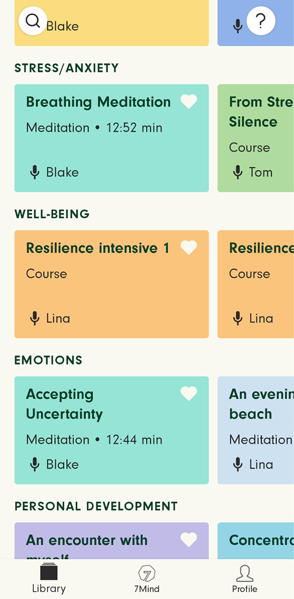
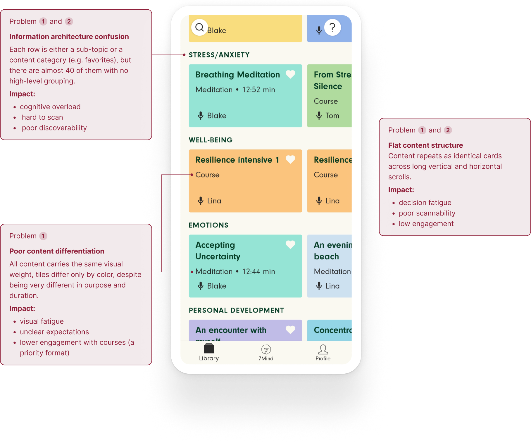
I audited the existing structure and how people were actually searching and browsing. The library had grown significantly through years of addition, accumulating nearly 40 top-level rows, with no hierarchy grouping related content and no clear logic for where something new should go.
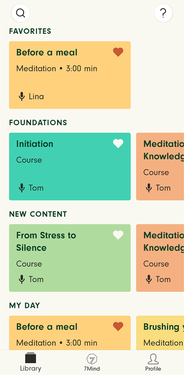
The behavioral data was just as telling:
~45%
of Library sessions ended without any content being opened at all
~70%
of Library sessions had more than 10 scrolls before a single piece of content was opened
35%
of in-app searches returned zero results or were abandoned before a selection was made
Note: figures rounded and absolute values omitted to protect confidential data.
To understand what was driving these numbers, I mapped how people actually approached the library into six recurring use cases.
These behaviors differed in mindset, frequency, and role, yet all six routed through the same undifferentiated system.
That mismatch produced failures at the structural and navigational levels:
- a structure of ~40 undifferentiated rows
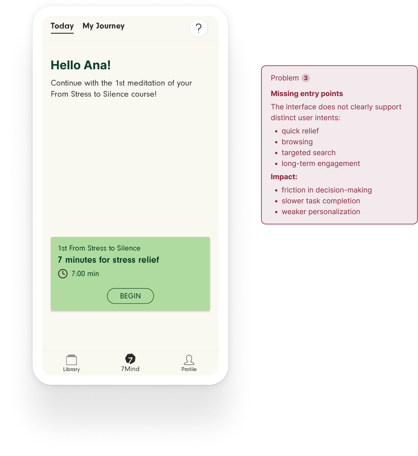
- no entry point aligned with user intent
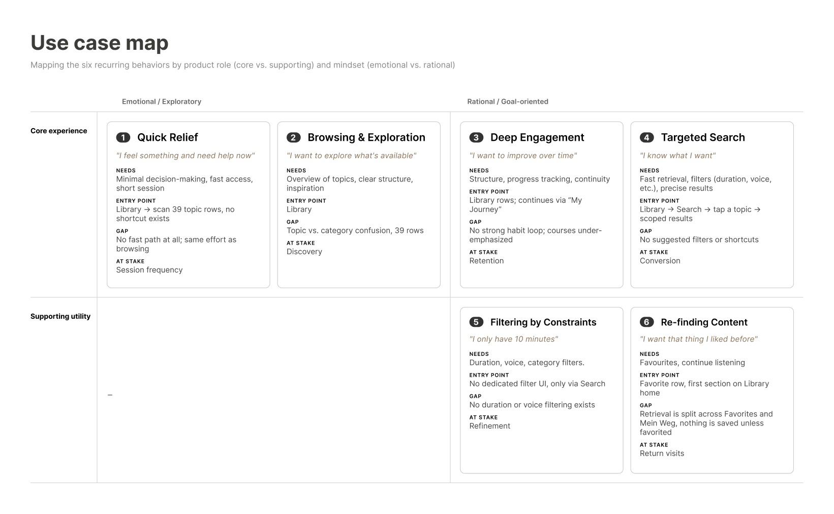
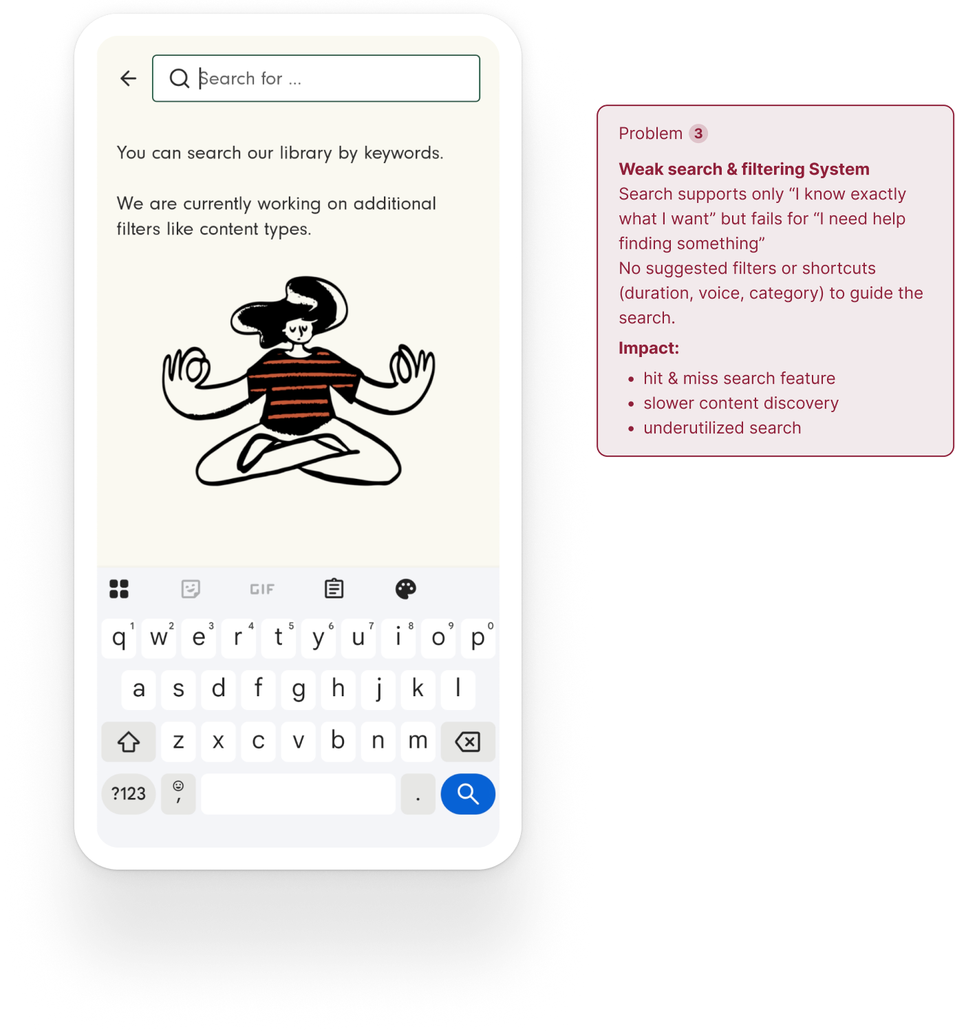
Together, these behaviors and gaps compounded into three connected problems:
High cognitive load during browsing
Discovery relied on long, repetitive lists that required excessive scrolling and made it hard to build a mental map.
Fragmented structure
Content lived across overlapping systems (mixing topics, sub-topics and formats) without clear hierarchy, making it difficult to predict where things belonged.
Navigation didn't match user intent
The system was organized around formats, while users think in terms of needs, creating friction when trying to find the right content.
Rather than optimizing the existing structure, the opportunity was to redefine the organizing principle behind the library.
Design Challenge
Turn the library into a scalable, intent-based system.
The Process
Keeping the content, changing how it's found
By flipping each problem around, these became the concrete goals I carried through every step of the process:
- Reduce cognitive load: Users should be able to understand the structure of the library at a glance.
- Support a scaling library: Find a solution that lets new content be added without degrading navigation patterns.
- Navigation guided by intent: Prioritize users' mental models over internal content categorization.
To pressure-test these goals, I conducted further research and interviews, this time with people who'd never used 7Mind as well as seasoned users, then ran a prioritization workshop with product and engineering to weigh what surfaced against technical and business constraints.
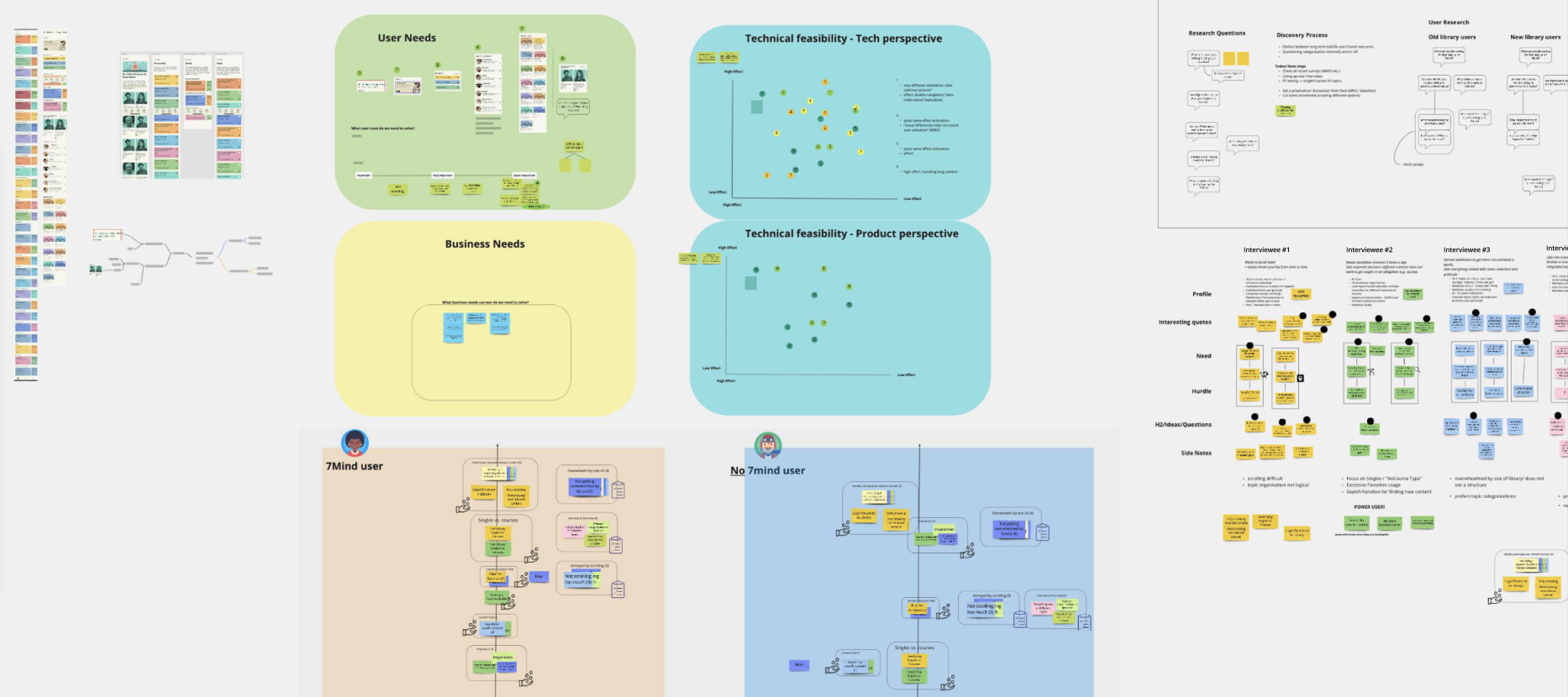
This confirmed that fixing discoverability, not adding features or content, was both the highest priority need and the most technically feasible move. Interviews had already shown users felt overwhelmed by the library's size with no visible structure, and the workshop validated that restructuring navigation, rather than personalisation or content expansion, was where effort and impact aligned.
Proposed IA changes
Library
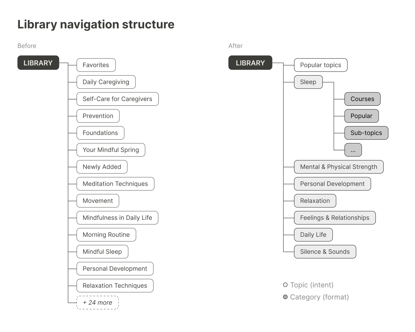
In the original structure, every new addition became its own top-level row — a specific topic, sitting flat alongside everything else, with nothing grouping related rows into larger themes.
The proposed IA adds a layer of seven broader intent-based topics that replace the 39 flat rows, each sub-divided into smaller sub-topic groups.
Content-based navigation becomes intent-based discovery.
Home
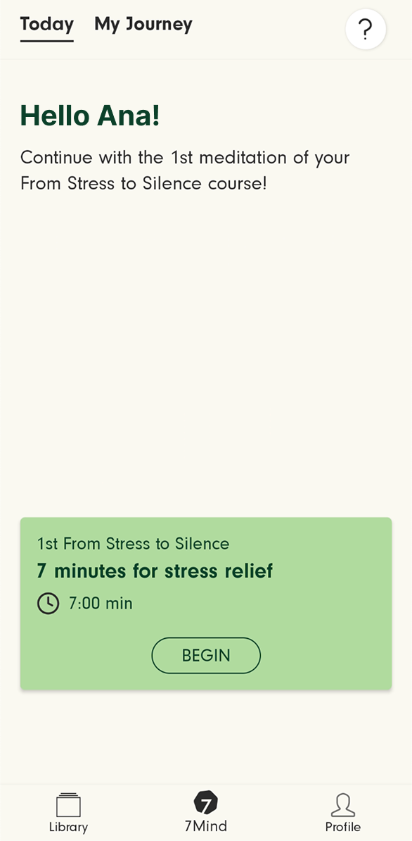
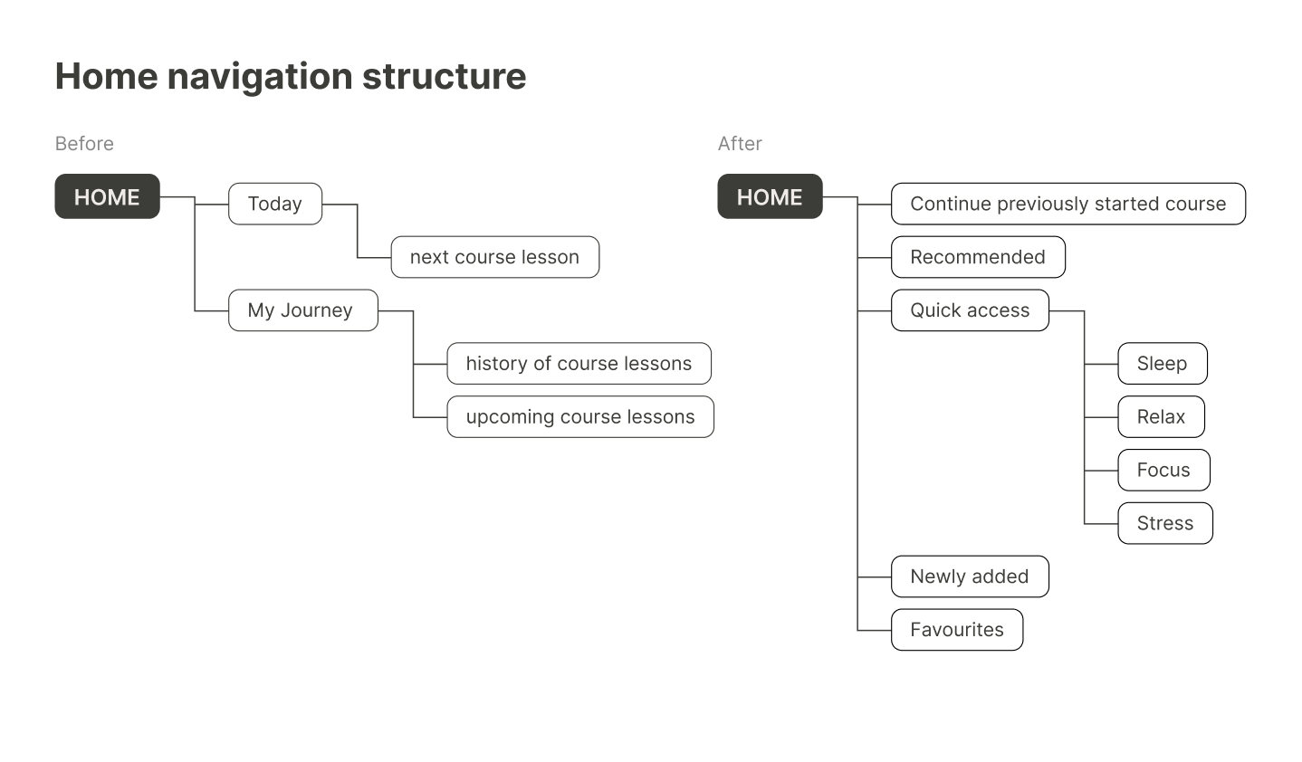
It used to only present the next course if the user had already started one. "My Journey," a separate tab within Home, saw low engagement and simply listed previously done and upcoming course lessons.
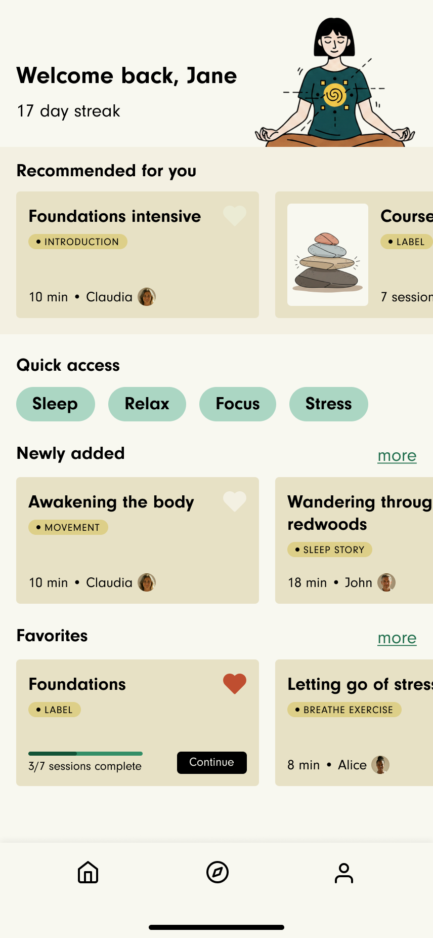
Home becomes a surface that gives alternative paths to engage: continue, discover, relieve, revisit. "Favourites" and "Newly added" moves out of the Library entirely, becoming dynamic collections on Home.
Before moving into wireframes, I checked the proposed taxonomy with the product and content teams — the people who'd need to maintain and grow it — to confirm the new topic groupings held up operationally, not just conceptually. I also brought the structure to a handful of users to see whether the topics matched how they'd naturally look for something, running alongside early wireframe exploration.
From IA to interface
The next phase focused on translating structural decisions into product experiences that improved clarity, speed, and discoverability across Home, Library, and Search.
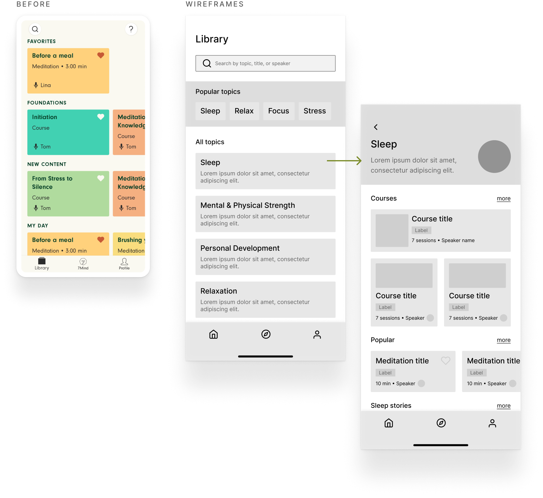
Library: redesign discovery for scale
I explored patterns that better differentiated topics, formats, and structured programs:
- Courses given clearer affordances, distinct from single sessions
- Labels added to identify each content type
This created stronger visual rhythm, easier scanning, and clearer first- and second-level relationships as users moved from topics into sub-topics.
Home: optimize for return behavior
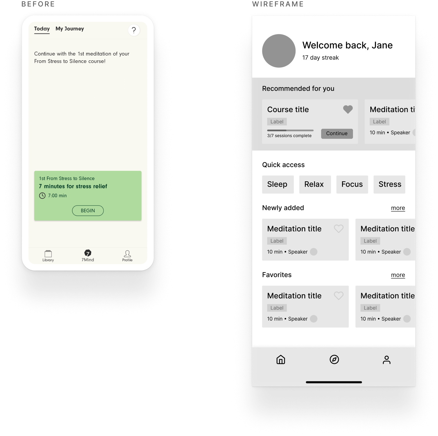
Home was redesigned around the highest-value repeat actions, led by what's most personal to a returning user, then by the urgency the research surfaced:
- Continue: resuming in-progress courses and recommendations based on prior content
- Relieve: offering immediate relief moments
- Discover: encouraging new content discovery
- Revisit: return to favorited sessions
Each module now maps to a distinct action so the next step is always obvious.
Search and filtering as primary tools
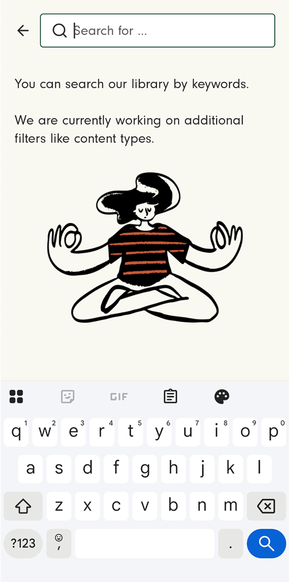
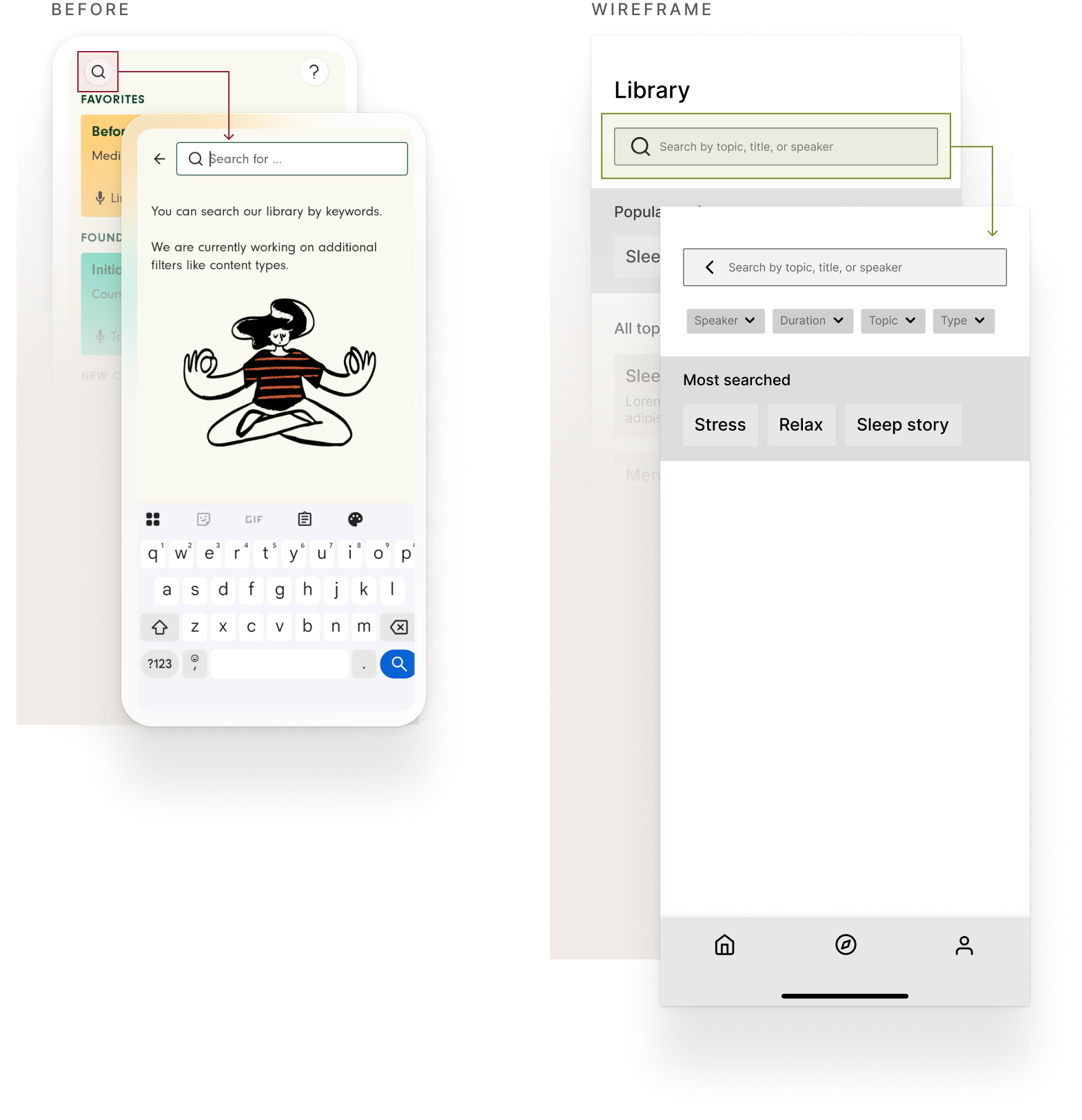
Search always lived at the top of Library, but as a small icon, easy to miss, that opened a separate screen with a full-width input (filters for speaker and format still listed as "in progress").
The redesign moves that same full-width bar directly onto the Library view itself. The search view now includes filters for speaker, duration, topic, and type (content format), plus "most searched" shortcuts (Sleep, Relax, Focus) surfaced as soon as you tap in.
Bringing the structure to life
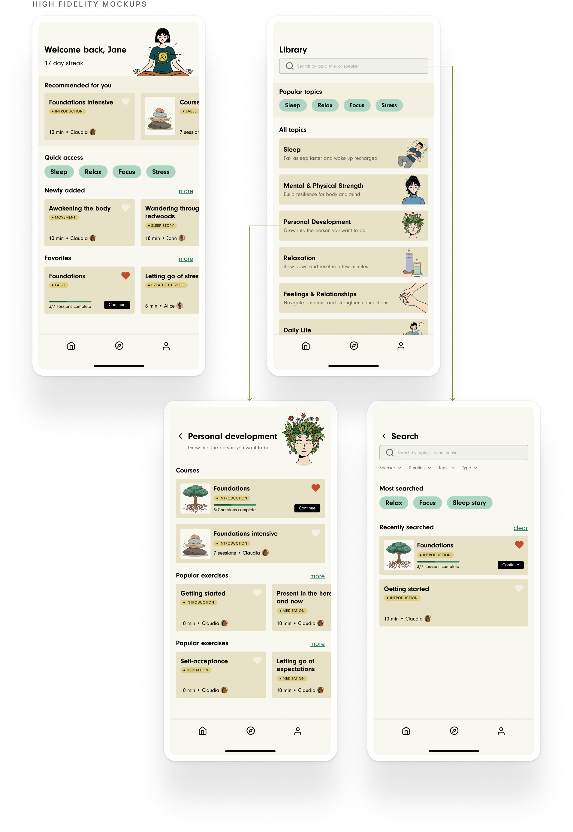
The visual language needed the same discipline as the structure.
The old interface used color arbitrarily carrying no real meaning. The new one restrains it to a few accents, reserved for what's interactive or in-progress: quick-access pills, active filters, progress bars, the Continue button. Everywhere else, a consistent set of warm, illustrated icons, do the differentiation work that color failed to achieve, while giving the app a calmer tone that reads as a meditation space rather than a utility.
That same restraint carries into how content is presented: a session uses the same card component whether it shows up on Home, inside a topic, or in search results, so recognizing what something is doesn't depend on where you found it.
Outcome
From static shelves to intent-based discovery
I left 7Mind before this went into build, so this case study presents the concept as I left it, not a shipped result. The app has since been redesigned and rebranded, and from what's visible today it follows a similar direction, organized around intent-based topics rather than a flat list. I can't say how directly this work shaped that, but it's a good sign the thinking held up.
What I'd do next
- Formal validation: what I ran was directional, a handful of users alongside the product and content teams, not a proper tree test at scale.
- Taxonomy governance: define clear rules for when something earns its own topic versus living as a sub-topic, so the sprawl that caused the original problem doesn't recreate itself.
- Support a migration and release plan: every existing piece of content re-tagged into the new topic/category model, and rolling out the new experience in phases (Library, then Home, then Search) rather than a single launch.
Measuring success
Upon launching these improvements, I would assess if the desired impact landed by measuring the following five signals:
Time to first play
Resolves the search-abandonment problem in a single session.
Search success rate
Another fast signal, same test, from the search side.
Course completion rate
Slower to move, but the real test of Deep Engagement's habit loop, not just its visibility.
Daily active sessions
Moves alongside course completion as the other habit signal.
Filter/category adoption
Tests whether the gap flagged above actually closes.
What I learned
Validating with the product and content teams, not just users, mattered more than I expected for IA work specifically — they're the ones who live inside the taxonomy day to day, and a structure that's intuitive for users but painful to maintain operationally doesn't actually solve the scaling problem.
I also came away realizing that a use case can be underserved and still show up loudly: "quick relief" kept surfacing in interviews precisely because the old IA gave it no path of its own, it just borrowed the same effort as browsing. That reframed how I'd prioritize a use case going forward — a recurring complaint is itself a structural signal, since the lack of a dedicated path can suppress the usage data you'd otherwise wait for.
Beyond the specific fixes, what kept me engaged was how many disciplines this pulled together at once: content strategy, information architecture, and behavioral research all had to move together, not sequentially. A meditation library isn't a typical content catalog either — the same session can serve completely different intents depending on someone's state of mind, so there's no single "correct" structure, only a better balance between clarity and flexibility. That tension is exactly the kind of design problem I find myself drawn to.